Mixed Media

MaybeNotso

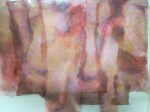
The background of the above was created with hand dyed tissue and further embellished with foil and gel pens.

The technique is simple

008

Requirements are few too. You need a background* (fabric or paper) the tissue and a matte medium (the one illustrated works particularly well).

009

Matte Medium is needed directly on the background

010

Apply it over the tissue too.

012

Cover the surface and leave to dry.

029

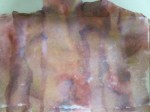
Once dry the beauty of the paper is visible. Interesting things can happen with the background too

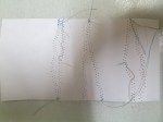
The above shows the front and back of a paper background

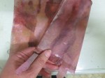
The above shows a background of cotton fibres. A piece of this paper is included in our packs so that you can experiment. This surface too is perfect for stitching – and I often use it for book covers.

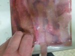
Sometimes there is a double use as a quick ‘print’ will result in a watercolour-like finish – and you can still use the paper as above. The video below shows the imprint left – remember to lift the tissue immediately while still wet – it can be transferred to another area for use or left on polythene to dry before peeling off for use.

Are you joining in?

A number of us are taking part in a challenge – 365 days of a minimum of 15 minutes creativity each day. Why not join us? Nothing formal – just do SOMETHING creative – and yes, that cake that you thought about making will count as well….. if you make it.

As an encouragement there are a few daily photo prompts being published here, interspersed with some colour prompts too. They won’t come every day of the year – but already I’ve seen the results of some lovely work.

If you decide to take part and blog about your results – don’t forget leave a comment at the bottom of the appropriate post. In the meantime – here’s a little stitching based on the last colour challenge.  The picture will take you there.

003b

Time to be bold!

008

Some of you know that I have a blog where I post a photograph each day. It is a picture from our garden – and it is always (almost) topical and from ‘today’. Above is the one posted today, and if you want to take a closer look at it you can do so here. Don’t go there, though, if you like perfection. Don’t go there if you only want to see perfect plants and perfect planting schemes. None of these are featured.

The above post shows the imperfections in the plants featured. It also, however, shows the importance of dark and light interspersed with medium tones. Take a walk in your garden today and study the tones – do you use all three in your work? The more work I see the more examples I notice that are simply ‘safe’ by being created solely in the middle range. Be bold! Don’t fall into that trap! Contrast in tone is probably more important than contrast in colour…………

%d bloggers like this: